2022 / CAMPUS CONNECT AI COURSE SCHEDULER & ADVISOR
Creating a Transformational Course Scheduling Experience with Machine Learning & AI

DePaul University's Campus Connect is the central hub for students to manage their academic progress, including tasks like financial aid, advising, and degree tracking.
To register for courses, students rely on this platform to enroll, switch, or access information about available classes. Our team focused on enhancing the course scheduling experience through the integration of Machine Learning and Artificial Intelligence, aiming to simplify navigation and reduce troubleshooting for students.
TIMELINE
8 Weeks (September - November 2022)
*Made prototype revisions between June - August 2023*
CONCEPT
Machine Learning/Artificial Intelligence Web Feature in an existing student management & course enrollment platform
TEAM
Me + 2 HCI grad students (Lisa & Nwaku)
my role
I was the UX/UI Designer who led the design sprint and ideation activities to foster consistent teamwork in comprehending the significant challenges students encounter when scheduling their courses each school session. I primarily designed the dashboard style and handled steps 1-2 of the automated course generator section. Moreover, I took charge of the interaction design for the entire prototype, ensuring alignment with the system's branding across all our design solutions.
Disclaimer ⚠️ This was a conceptual project with a focus on proposing a feasible solution to introduce ML/AI in the course navigation and selection process of Campus Connect in order to potentially allow students to complete enrollment tasks more efficiently and comfortably.
the problem
DePaul Undergraduate and Graduate CDM students face difficulty in selecting what class to enroll in the next quarter because of worrying about class availability, class format, advising help, and prerequisite needs. New students do not receive guaranteed onboarding information for utilizing DePaul’s Campus Connect System and when faced with navigational obstacles, they instead rely on other sources, particularly the DePaul CDM website.
What is CDM? 💡 CDM stands for DePaul University's "Jarvis College of Computing & Digital Media"
TARGET AUDIENCE
DePaul Students (affiliated in the CDM community)
• First Year Students: Collecting data of experiencing a new college-based software at DePaul University
• Transfer Students: Collecting data of comparing course enrollment experiences in other schools besides DePaul
• Graduate Students: Collecting data of students enrolling in graduate courses and sharing their past course enrollment experiences
THE GOALS
The research goal of this project was to understand how DePaul University students are using the existing systems today and what critical steps are causing frustration and confusion when exploring & enrolling in new classes.
Our overall solution should inform an ML/AI solution that is desirable, practical, robust, ethical, and usable.
For users
Provide a solution that can provide a seamless course enrollment process to support students’ educational goals with less technical difficulty.
Business objectives
Improve usability of the existing Campus Connect system for DePaul University students with ML/AI course selection
the solution
AI Course Exploration • 4-step Automated Course Scheduling System • AI Vinny
Intro to the Automated Course Exploration
MY INDEPENDENT CONCEPT
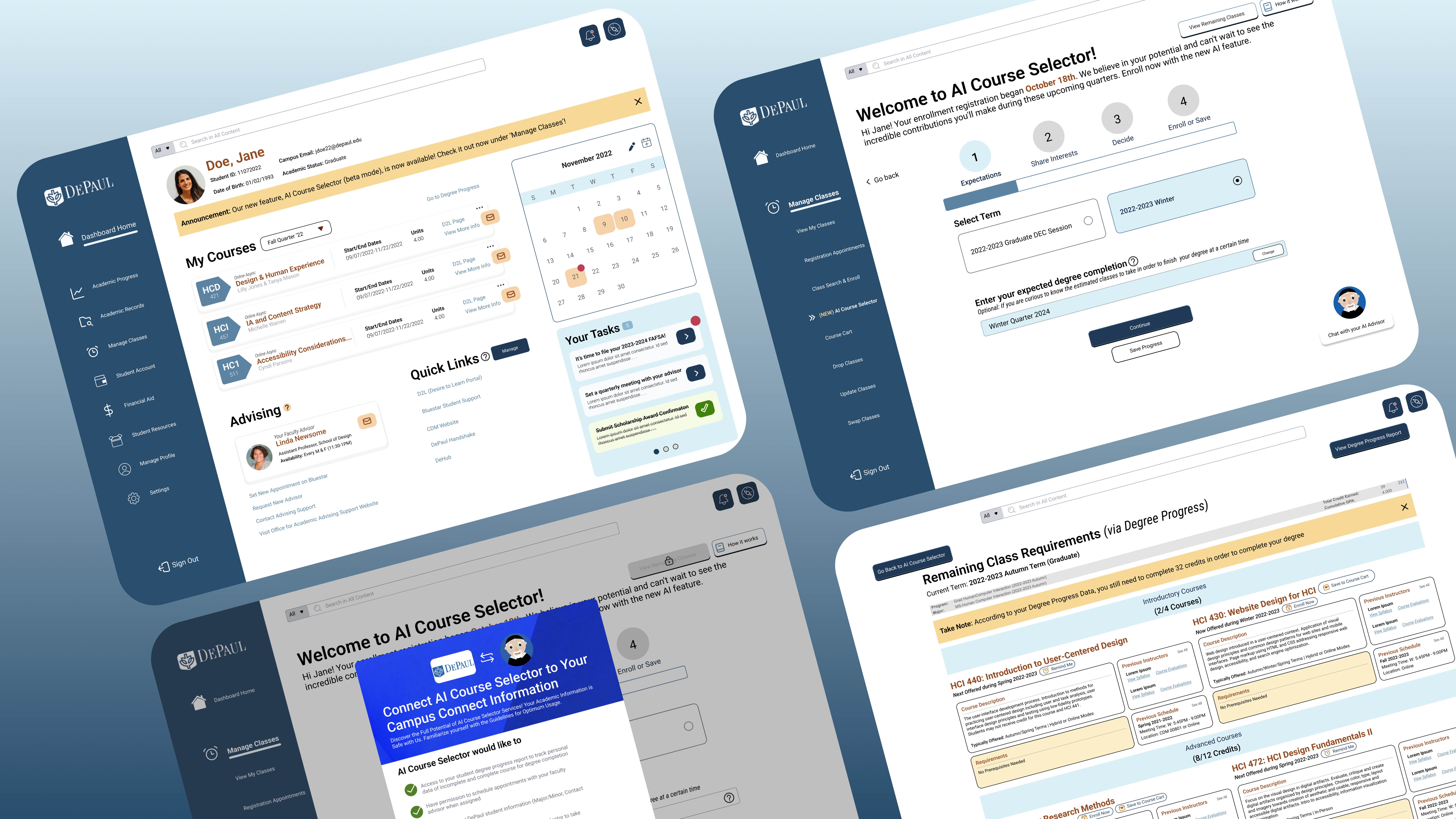
Under 'Manage Classes,' the AI Course Selector introduces automated course scheduling with a revamped homepage. To inform users about data collection, permission will be sought first. Students can explore their remaining classes via their degree progress data and access AI Advisor Vinny throughout the page.
Automated Scheduling System
COMBINATION OF TEAMMATE #1 (NWAKU) & I'S CONCEPT
The course scheduling experience advances in stages, allowing machine learning to comprehend students' course interests while considering their degree progress. To streamline manual course navigation, the automated generator will create schedule options based on their topic preferences.
AI Advisor Vinny
TEAMMATE #2'S (LISA'S) CONCEPT
Students will access AI Vinny, an advisor chatbot capable of prioritizing urgent student inquiries, and mirroring interactions with human advisors. This chatbot is expected to schedule advising appointments, complete enrollments, and more.
CHAPTER 1: UNDERSTANDING THE PROBLEM DIRECTLY FROM THE USERS
We dug deeper about why fellow students are having a tough time with course scheduling on the platform.
SURVEY RESEARCH
First, we conducted a survey with 32 students to identify trends in the pain points they encountered while using DePaul's resources, including Campus Connect.
Survey Data Highlights
INTERVIEWS
Then, to grasp information of Campus Connect's course scheduling challenges further, we conducted 30-45 minute semi-structured interviews with 15 students. This provided insights into their navigation difficulties and helped shape our solution focus on course enrollment challenges and advisor support.
If interested, please view the attached Interview Protocol Script HERE
How did we recruit? 💡 It involved promoting interviews through our university's participant pool, peers, and student organizations, mainly connecting with graduate students but also including undergraduates.
CATEGORY OF QUESTIONS ASKED
Key Insights
CHAPTER 2: CHOOSING THE RIGHT STRATEGIES WHILE KEEPING IN MIND OF THE JOURNEY
We analyzed where students find degree requirements and visualized their course selection journey.
JOURNEY MAP
After discussing with the team about potential improvement opportunities, our ideas definitely favor automating the experience with Stage 2: confirming course requirements → Stage 3: selecting classes to further fasten the process of actually enrolling to classes based on their degree requirements. Our ideation interests were more towards creating an AI system where students don’t have to just rely on external resources to learn more about available courses they can enroll in. The map helped us see the bigger picture of what takes more manual time and what parts could be more automated.
Constraint ⛔️ We took a little longer on deciding whether to connect the focus of the advising section vs. the course enrollment section because both have connected functionalities that help students decide which courses they should enroll to next.
01 How Might We . . .
provide a single source of truth for course selection within Campus Connect utilizing AI?
02 How Might We . . .
better accommodate unique needs of specific groups of students within the DePaul student-body, including international students, first-year students, transfer students, etc. by improving familiarity with the Campus Connect system through AI guidance?
03 How Might We . . .
improve the organization of the academic planning system in Campus Connect to keep students engaged and interested in choosing classes that directly align with degree requirements, course history, prerequisites, interests, and course timing?
CHAPTER 3: GETTING NITTY GRITTY INTO THE DESIGN PROCESS
We evaluated a variety of concepts we made, which led us to split design responsibilities of the proposed solution.
DESIGN SPRINT SKETCH PROPOSALS - VIA CRAZY 8'S & SOLUTION SKETCH
My approaches to my ideations led to adding more cool interactions within the existent features. My perspective in customization is being able to see all the options smoothly with larger visuals because I felt that the current design of the Campus Connect platform was lacking in interesting features.
I suggested to my team that we practice design sprint activities in our project. Drawing from past experience, I am aware that this approach can ignite our creative thinking, especially considering the insights we've recently gained from the students. Given our tight timeline, we decided to dedicate our personal time to this effort. This way, our next team meeting could be productive and focus on creating the storyboards.
To determine the effectiveness of our solution proposals, we tested our storyboard ideations through early-stage concept testing.
STORYBOARD CONCEPTS FOR TRIPTECH TESTING
We conducted 2 different group testing sessions to collect opinions from students about which storyboard concepts they like and which parts of the concepts that they desire to exist in the Campus Connect platform.
As a trio group, we came to a unanimous decision to individually choose a separate AI/ML feature from our sketches, which we believe could encapsulate the full functionality of the new AI section of the course scheduling feature in Campus Connect. This step wasn’t possible without guidance from a research article about Trip Tech testing, provided by our professor, to get to know one way of doing an early stage concept testing with storyboards.
My concept: According to the Trip Tech testing, the customization I provided in my storyboard concept seemed to be less desired because they commented more on how much they’d need to double verify and trust the AI functionality.
On a positive note 👍 6/9 students rated the features of my concept a 4 or 5 out of 5 to likely use the AI/ML solution displayed in my storyboard. At least two mentioned liking the save progress within the course selection so they can go back whenever.
Students raised desires for personalization and more opportunities to double verify information, so we gave it a shot of combining the different features that they liked.
SIMPLICITY OVER COMPLEXITY - COMBINING IDEAS THAT BEST SUIT A SEAMLESS EXPERIENCE
While revising some of the wireframes, I was assisting Lisa in adjusting more prototyping interaction on her AI advisor concepts and considering ways to make Nwaku’s prototype screens match the design consistency on my screens. As the teammate who had more experience with Figma, this was an opportunity for me to share my skills with them [teammates] and provide some tips on how to design the wireframes a bit easier as a beginner through Figma.
Important Note 💭 During this time, my next approach was looking back at why parts of my teammates’ concepts were desired more than mine to improvise for the team. Even though my teammate Lisa ended up designing the AI advisor in the final design, I took inspiration from her storyboard concepts while working with Nwaku to emphasize the automated feature of course enrollment.
MEDIUM FIDELITY WIREFRAMES
After the early stage concept testing, I collaborated with Nwaku's to create a dashboard-displayed AI course selector system. I wanted to create a unified platform where some parts are automated in addition to a potential assistance with a chatbot (via Lisa's preferred design responsibility). However, my initial experimentation included a lot more button interactions than expected.
Constraint ⛔️ From our professor's feedback, how I originally displayed the course selection system made it look more complicated to display the 'automated' side of things. It looked more 'labor intensive'. Therefore, I had to scrap off some of the elements I arranged on my mid-fi flows to add a more "auto-generated" content for the final prototype.
CREATING A RENEWED CONCEPT OF THE EXISTING SCHEDULE OPTIMIZER ON CAMPUS CONNECT
User research indicated that students weren't effectively using the Schedule Optimizer under the 'Manage Classes' tab. To address this, I incorporated elements from this existing feature into my new concept, focusing on enhancing the ability to 'filter and search' for classes. After conducting a quick S.W.O.T. analysis, I understood that the Schedule Optimizer mainly assists prediction of schedules without directly aiding course enrollment, which can unnecessarily prolong the enrollment process for students.
In order to better visualize the impact of our solutions, we discussed the levels of automation.
AUTOMATION LEVEL CONSIDERATIONS
According to an automation level chart from another article we were introduced to, we applied our learnings from our user research in determining how automated course navigation & selection should be in Campus Connect. Putting them at these levels should not only inform the student about the AI capability of automating a suggestion of courses based on degree requirements and needs, but also allow them to still have control of the management of their classes. This arrangement was solely based on my team’s understanding of the automation levels post-early stage concept testing.
Level Descriptions
• Information Acquisition - automation of sensing & registration of input data
• Information Analysis - automation of cognitive functions as working memory (in this case, predicting the course needs based on student’s academic data)
• Decision Selection - automation of the decision among decision alternatives
• Action Implementation - automation of conducting the action choice
We visualized that despite the existence and value that automation can bring to Campus Connect, there is not enough evidence from our user research to conclude that students want their course navigation & scheduling process to be fully automatic. Therefore, our level choices were placed between 2-7.
Automation Level Chart
I then took the initiative to create a style guide.
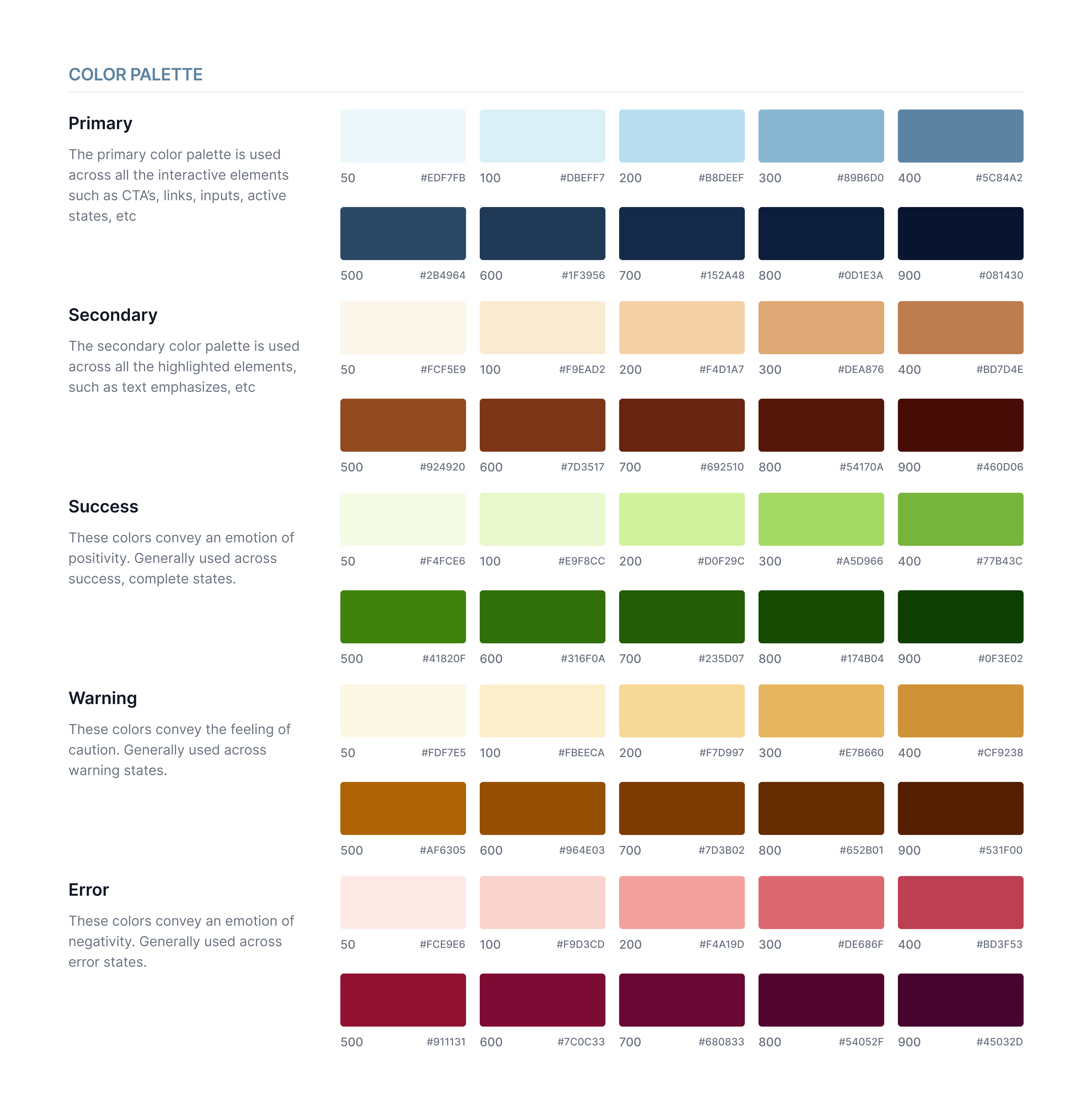
I have personal interest to learn more about the importance of branding & design systems due to prior brand design practices. To keep the new concepts as realistic as possible, I organized the color scheme and typography that would best match the current design of Campus Connect. Choosing Roboto as the default font was the closest simple font that I believe matched the style of the current platform.


Keep in Mind: The primary shades we used were in the '500' level, but having the variety of shade levels helped us have more flexibility to potentially use the other shade levels depending on the contrast overlays we needed to apply.
CHAPTER 4: TESTING OUR IDEAS
Testing our prototype at a limited time lets us fix minor UI bumps in the course selection experience
HIGHLIGHTING MAJOR FEEDBACK & CHANGES
Throughout the remaining time in the project, we were able to test our high-fidelity prototypes with two users: one HCI alumni and one current HCI student. Their feedback gave us clarifications on the details we may have prioritized less and where to improve the user interface displays. It’s a relief that they liked the concepts overall.
Important Note 💭 After going back to viewing this project post-course for a few weeks (June - August 2023), I just made some improvement on a couple alignments on the overall prototype since I learned more about applying auto-layout via YouTube. Through these "AFTER" pictures, do feel free to take a closer look on the difference of the alignments of the revised UI.
BEFORE: Navigating the remaining classes to finish the degree requirements were confusing to find due to terminologies chosen. "Calculate Remaining Classes" didn't scream the right direction for the users to find this source of information.
BEFORE: Looking for course prerequisites under Degree Requirements wasn't directly easy to find.
BEFORE: Uncommon terminology is not an ideal route when users make use of search filters. A better label was preferred. "Instruction Mode" was meant to categorize if a class was in-person, virtual, hybrid, etc.
AFTER: I added a more familiar term, which is "View Remaining Classes". Also, the 'expected degree completion' input is optional to show a clearer indication that it's up to them to decide to input their expected graduation year.
AFTER: I highlighted the prerequisites sections, in yellow so that they can better navigate them.
AFTER: I changed the search filter terminology to "By Class Format" since this was more familiar to one of the user testers at least. In addition, I personally made the search filter input dropdown to fully align with the main input box for a better view of the options.
Despite the limited testing time, our ML/AI design concept brought us a positive outcome from our professor!
It has been a success practicing the implementation of Machine Learning and AI through a familiar platform during college. Our professor, Ovetta Sampson, guided us with advice as we went through the project and useful articles to help understand the value of Machine Learning and AI, which is her expertise in the UX field. She encouraged us to think outside of the box of unique AI opportunities. I am glad that she had appreciation for the final concepts we proposed, claiming that this was “the only one that provides what I think is the global and long-term view of course scheduling which I think is currently missing today”.
CHAPTER 5: MY REFLECTIONS & NEXT STEPS
My takeaways led me to thinking, so what now?
Defend your design decisions if you must, but DON'T PUSH IT.
Sometimes, my solution proposals may not meet user expectations, and that's okay. If users find the solution hinders their tasks, it's crucial to revisit the problem and adjust features to simplify it based on user preferences. Empathizing with users' concerns is a top priority.
Practice Choosing Simplicity Over Complexity.
Prioritize recognition over recall in design. Familiar content in tasks makes them more user-friendly, so I should further avoid unnecessary complexity.
It’s Okay to Give in When it Comes to Building More Teamwork.
There were disagreements that occurred at times during this project revolving around task responsibilities, but after coming to a compromise and giving in to not doing more work, completing the project flowed more smoothly.
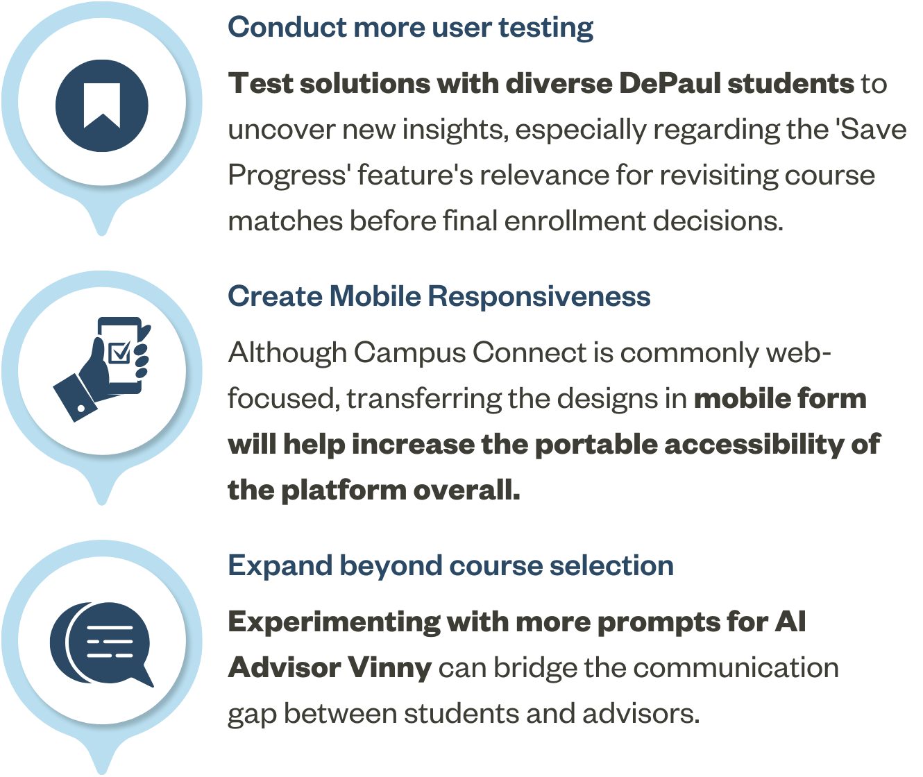
if we had more time . . .

Did any of my work catch your attention? Let's Connect!
Kindly drop a message through malcantara.design@gmail.com or through LinkedIn for any opportunities you’d like to share or have a simple coffee chat! Thank you for visiting. Looking forward to getting to know you!
© 2023 Made with lots of 💭,☕️,🍽, 🫶🏻 by Maelanny Alcantara.